website feedback, possible help?

Cruisertrash

Hard Core 4+
Joined
Aug 18, 2020
Messages
3,121
Location
Denver
Dude the site looks GREAT! Much easier to navigate! I drilled down and clicked on a few products. I don’t know if you changed the product pages but the buy button is closer to the top with the easily digestible info, and the deep dive info at the bottom. Huge improvement! One outstanding thing I see is that you could make the buy or “add to cart” button bigger.

I had a private meeting with one of the marketing directors at work last year. I bought them lunch and we chatted about my side business for an hour - really it was them info dumping. Two things that they said tangibly improve sales (and they showed me data to back it up) are having the buy button “above the fold”, meaning above the bottom of the screen when the page loads (no scrolling to see the button), and having the buy button be a decent size. I don’t know that I’ve necessarily seen huge results from it, but probably a marginal increase for sure.
 

nakman

Rising Sun Member
Staff member
Joined
Aug 23, 2005
Messages
15,749
Location
north side
hey thanks Jim, really appreciate it. It's funny, there's a setting for that button and I have always consciously made it smaller- I could try it the other way though, just have always preferred to be more subtle and less pushy as that's my approach to everything. But I know, it's ecommerce..

I could look at moving the buttons up though, I usually like to do some words, then a gallery, then some more words, then another gallery, then the buy it now buttons, then a video... that's been the page formula. And really driven by my desire to have someone only purchase after they understand what they're getting, which should yield higher satisfaction and fewer returns. I guess the answer is try it the other way and see what happens though, huh.
 

Cruisertrash

Hard Core 4+
Joined
Aug 18, 2020
Messages
3,121
Location
Denver
hey thanks Jim, really appreciate it. It's funny, there's a setting for that button and I have always consciously made it smaller- I could try it the other way though, just have always preferred to be more subtle and less pushy as that's my approach to everything. But I know, it's ecommerce..

I could look at moving the buttons up though, I usually like to do some words, then a gallery, then some more words, then another gallery, then the buy it now buttons, then a video... that's been the page formula. And really driven by my desire to have someone only purchase after they understand what they're getting, which should yield higher satisfaction and fewer returns. I guess the answer is try it the other way and see what happens though, huh.
I totally get that too. I have one particular product with a pretty high "confusion rate". It seems simple enough to me, but of course I designed and built it. I've changed the description on the website, changed the wording in the instructions I provide, and still get emails to the effect of "I don't get it". One thing that I suspect might be that I'm being TOO wordy and people read about a sentence and a half and then zone out. Maybe less is more? I'm not sure.

One thing you could do to save "space" above the "fold" is to make the pictures into a gallery. So one large photo with tiny thumbnails below it. Click on a thumbnail and now that photo becomes the big one, in the same place the previous one was. I do like the videos at the bottom. I need to get better about making videos ... so far I have exactly zero. I hate being on camera, but starting a YouTube channel for install walkthroughs is on my list for 2025. Do you see any return from that?

Also, I spotted my truck on your site. I'm famous!
 

nakman

Rising Sun Member
Staff member
Joined
Aug 23, 2005
Messages
15,749
Location
north side
100%- videos have been a decent lead gen, but also they've elevated the conversations I'm having considerably, as a lot of times someone's first inquiry begins with "I saw your video on ..... and just want to make sure I understand this one thing..." which is light years ahead of when I had to explain the whole thing from the beginning every time. Yes it's tough to man up and be vulnerable, I'm the same way... but then once I get started I get into it. Kinda like cleaning the house.
 

Cruisertrash

Hard Core 4+
Joined
Aug 18, 2020
Messages
3,121
Location
Denver
100%- videos have been a decent lead gen, but also they've elevated the conversations I'm having considerably, as a lot of times someone's first inquiry begins with "I saw your video on ..... and just want to make sure I understand this one thing..." which is light years ahead of when I had to explain the whole thing from the beginning every time. Yes it's tough to man up and be vulnerable, I'm the same way... but then once I get started I get into it. Kinda like cleaning the house.
Awesome. That puts a little wind in my sails to get started.
 

rover67

Rising Sun Member
Joined
Nov 1, 2007
Messages
9,805
Location
Boulder, Co
I love the new layout, perused it and it's much easier to browse. I would make the buttons to buy things bigger, I actually think they are small now. I like that suggestion Jim made. Actually just realized I need a beanie and an antenna mount.
 

nakman

Rising Sun Member
Staff member
Joined
Aug 23, 2005
Messages
15,749
Location
north side
I love the new layout, perused it and it's much easier to browse. I would make the buttons to buy things bigger, I actually think they are small now. I like that suggestion Jim made. Actually just realized I need a beanie and an antenna mount.
Awesome thanks for looking!
 

nakman

Rising Sun Member
Staff member
Joined
Aug 23, 2005
Messages
15,749
Location
north side
Tim, real honest here: I’ve looked through your website before find it really confusing. It’s way too much info, yet difficult to find the info I want to know. That’s not an insult, we’re buds and I say this for improvement. That’s what friends do, help each other improve. Long post ahead…
Alright, so at the advide of Jim and many others, I've invested a ton of time into a new Shopify site. The proverbial paint is still dripping wet here, so be kind... but here you go: https://gamiviti.shop/

I still need to go through some of the products, adding dimensions, weights, cleaning up text, pictures, videos... the good news is I started with over 160 products (from a bot scrape) and have it whittled down to under 90 now... a lot of that was just consolidations.

but the big hope here is the new site should be easier to find the thing you were looking for, or at least be able to find stuff by vehicle, product category, etc. Would welcome any/all feedback, thanks! :cheers:
 

gr8fulabe

Rising Sun Member
Joined
Sep 3, 2005
Messages
1,805
Location
Boulder Canyon
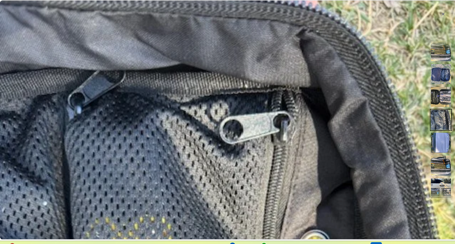
Love it overall! But I do get the below issue. not sure if it is just my browser/computer, or will be for all. But if I click to zoom in on a pic, it is huge & I can't, "grab" it to move it around. So I can only see the little part it zooms into.

1794613730834.png
 

Johnny Utah

Rising Sun Member
Joined
Mar 6, 2015
Messages
1,657
Location
Arvada
Hey Tim, I just spent about 30 minutes on your new site. It’s much more user friendly!

I was on my iPhone and did not experience what @gr8fulabe mentioned with the photos.

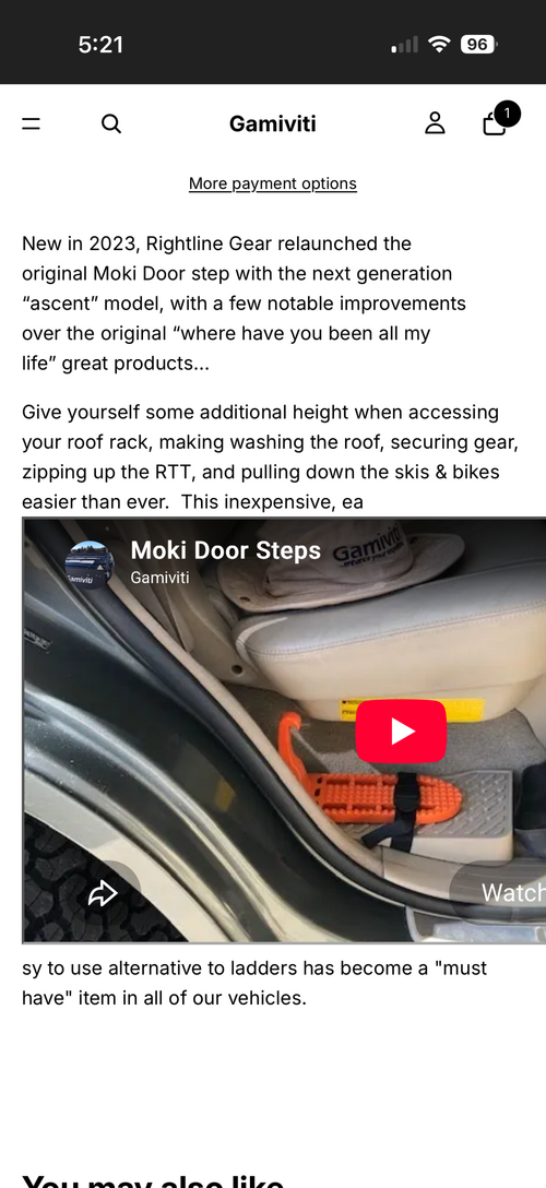
The only issue I found was that the text in the description was broken up by an imbedded video. See attached image.

Otherwise it looks really good! Easy to search and the menu is laid out clearly.

Well done!
 

Attachments

  • IMG_7739.png
    IMG_7739.png
    1.4 MB · Views: 5

On the RX

Rising Sun Member
Joined
Nov 19, 2016
Messages
2,422
Location
Superior
I think it is very functional and user friendly. I like that you can swipe photos before you drill down to the actual product description. I discovered that accidently!
 
Back
Top